From mass to a path
The original metallic effect carries the image on its surface. The final direction places emphasis on the stroke itself.
HIART / Four Sides Media / DESIGN STORY
From a layered golden pyramid to a mark that brings the name into a single geometry. Four Sides is a story of reorganising meaning.
Begin the story ↓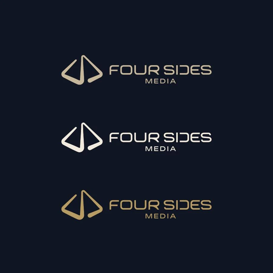
01 / THE QUESTION THAT OPENS THE STORY
The original logo shared with us combines a pyramid, metallic effects and heavy lettering. The final direction retains the geometric connection, with a continuous stroke and deliberate space.
02 / EXPLORE THE IDEA
Choose a step to reveal another reading of the idea.
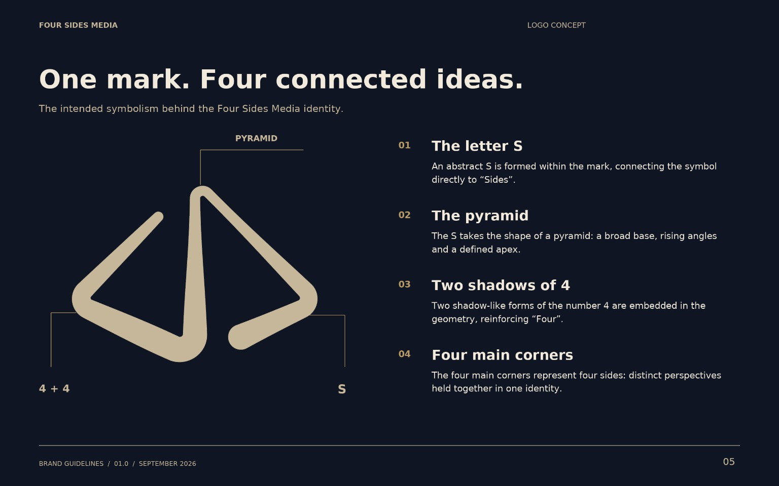
An abstract S within the mark connects it directly to “Sides”.
03 / FROM IDEA TO IDENTITY
The original metallic effect carries the image on its surface. The final direction places emphasis on the stroke itself.
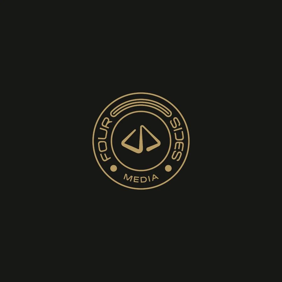
The circular lockup gives the same geometry a different setting: another expression of the identity.
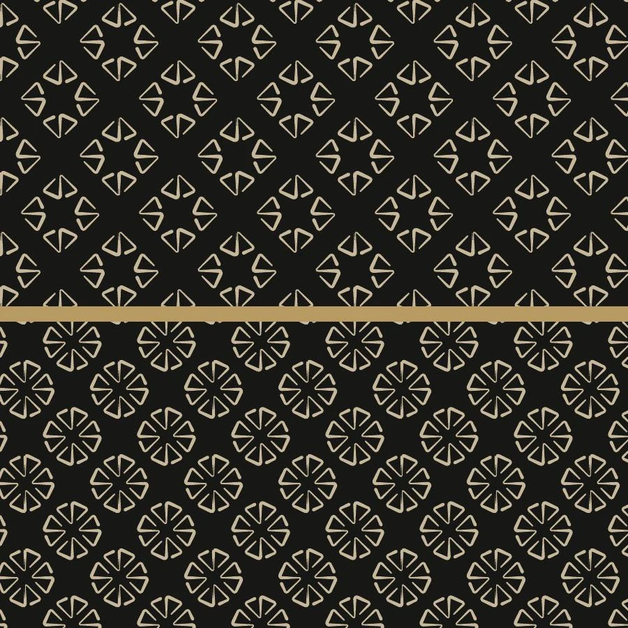
Repeating the mark turns angles and spaces into a visual system beyond the logo.
04 / THE IDENTITY IN A WIDER SPACE
Choose a project board or open the image to inspect the details.
The comparison uses a vector reconstruction of the supplied original logo. The final symbolism follows the supplied explanation; the wave concept is shown as another exploration, not the final direction.
THE NEXT CHAPTER