

The idea meets colour
Blue connects the identity while warm tones enter the product applications.
HIART / JOOD Coffee / DESIGN STORY
JOOD starts with a small abstraction and expands through colour, pattern, packaging and signage. Discover how a mark creates its visual family.
Begin the story ↓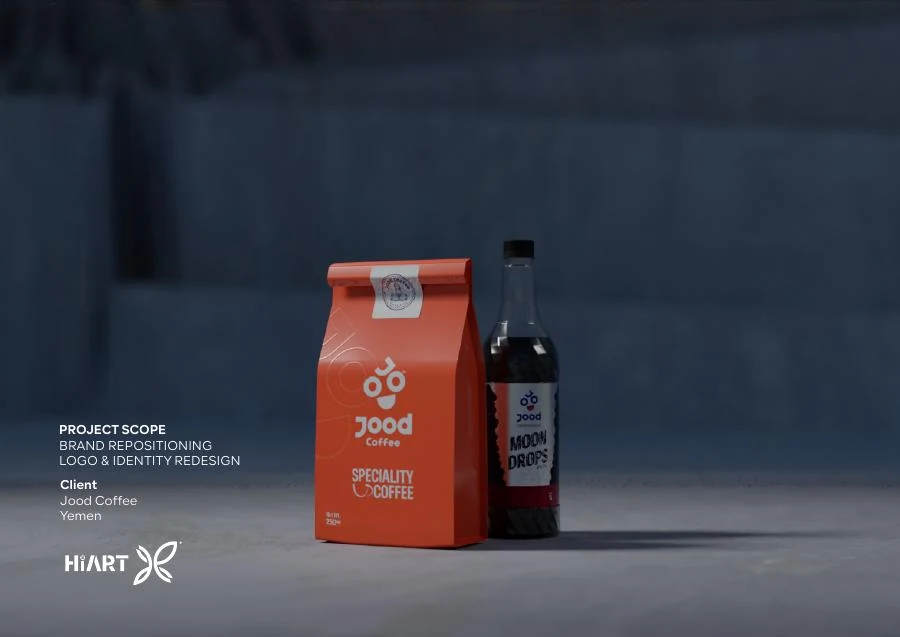
01 / THE QUESTION THAT OPENS THE STORY
The concept page combines a face, geometric fruit abstraction and the name. These are vocabulary for the identity shown in the guide.
02 / EXPLORE THE IDEA
Choose a step to reveal another reading of the idea.
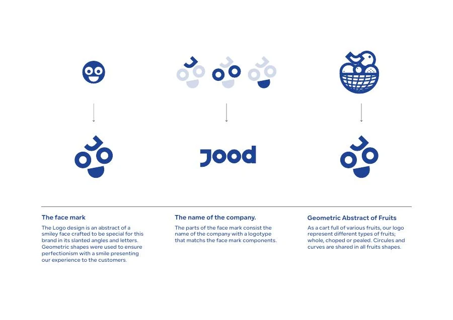
A few circular details suggest a face in a simple, repeatable form.

03 / FROM IDEA TO IDENTITY
Blue connects the identity while warm tones enter the product applications.
The pack gives the identity room while information and imagery describe the contents.
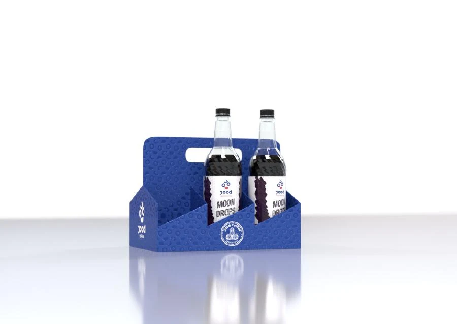
The carrier reuses colour and pattern to connect individual items.
04 / THE IDENTITY IN A WIDER SPACE
Choose a project board or open the image to inspect the details.
These applications come from the original presentation. Pattern scale changes are a viewing interaction, not a redesign.
THE NEXT CHAPTER